Colour matching on printed mats: what is actually controllable.
A brand colour is usually defined as a number. On a textile mat that number becomes a range, because the substrate, the dye and the light all have an opinion. Knowing which parts are controllable stops a colour argument before it starts.
Filed under SpecPublished September 2026Reading 5 min
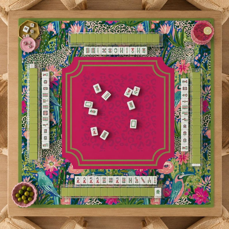
Plate 01Saturated ground, tight repeat
From screen to substrate
Your file is probably RGB — a screen gamut, backlit, wide. Sublimation printing is CMYK dye on polyester, a much smaller gamut, and the substrate adds its own tint. Saturated oranges, deep blues and some greens fall outside what the process can reach, and they are the colours brands care most about.
So the first honest statement is: we can match the hue, we cannot always match the saturation. A neon coral will print as a warm coral. A deep navy will print slightly lighter on a matte face than on a glossy one.
What is controllable
Factor
Controllable?
How
Hue
Yes
Correct file in CMYK, proofed on the substrate
Saturation
Partly
Limited by the dye gamut; check a proof
Metallics / neon
No
Not possible in dye-sublimation
White ink
No
White is the unprinted substrate
Batch-to-batch drift
Yes, within tolerance
One fabric lot, retained sample, ΔE ≤ 2
Appearance under shop light
Partly
Approve in daylight, not in a lit room
Fig. 02Dark ground drift
How to approve a colour properly
Ask for a proof on the actual substrate, not a paper proof. Paper and polyester render the same CMYK file differently.
Look at it in daylight, next to the physical object it has to match — a product box, a business card, a previous mat.
Write the tolerance down: 'match to within ΔE 2 of the approved proof'. A number ends the discussion that 'slightly different' starts.
Keep the proof. It is the only artefact that can settle a dispute six months later.
Designing around the limits
If a brand colour is critical, do not put it in a large flat field. Large areas of one colour show a shift more than small areas do, and they are harder to correct without affecting everything else.
Instead, put the brand colour in a logo or a small element where the eye has a reference next to it, and keep large fields in neutrals. The mat reads as on-brand and the tolerance problem quietly disappears.
For packaging and printThe same rule applies to the box. A mat and a box printed by different processes will never be an exact match — design them so that close is enough.
Fig. 04Two seasons apart
Plates
Seen on the press
03 plates
Run one01Run two02Run three03
Questions
Can you print Pantone colours exactly?
No — sublimation is a CMYK dye process, not a spot-ink process. We match the hue and get as close as the gamut allows, and we will tell you the expected delta before printing. For brand-critical work, approve a proof on the actual substrate.
Why does my red look orange on the mat?
A saturated red is often outside the CMYK gamut and shifts toward orange when converted. Supplying the file already in CMYK, or asking us to convert and proof it, shows you the shift before production rather than after.
Can you print white?
No. White in a sublimation print is the unprinted substrate showing through. If you need white detail on a dark background, the design has to use the base colour or a white-coated face.
How much variation between batches is normal?
A ΔE of 2 or less is a professional tolerance and is not visible unless the two pieces are side by side. Anything above 3 is worth querying, and above 5 is a reprint.
Do you keep colour records?
Yes — the print file, the ink recipe and the retained sample are archived, so a reorder in a year starts from a known target rather than from a guess.
Does the same file match across two different substrates?
No. The same CMYK file printed on matte diatomite and on satin polyester reads about a step apart, because the surface absorbs and reflects light differently. If two products must match, proof both, not one.